Royal SB Academy — brand identity and website design
A crowned monogram and a brand-led digital presentation for a beauty centre and academy: two parts of a cohesive visual identity.

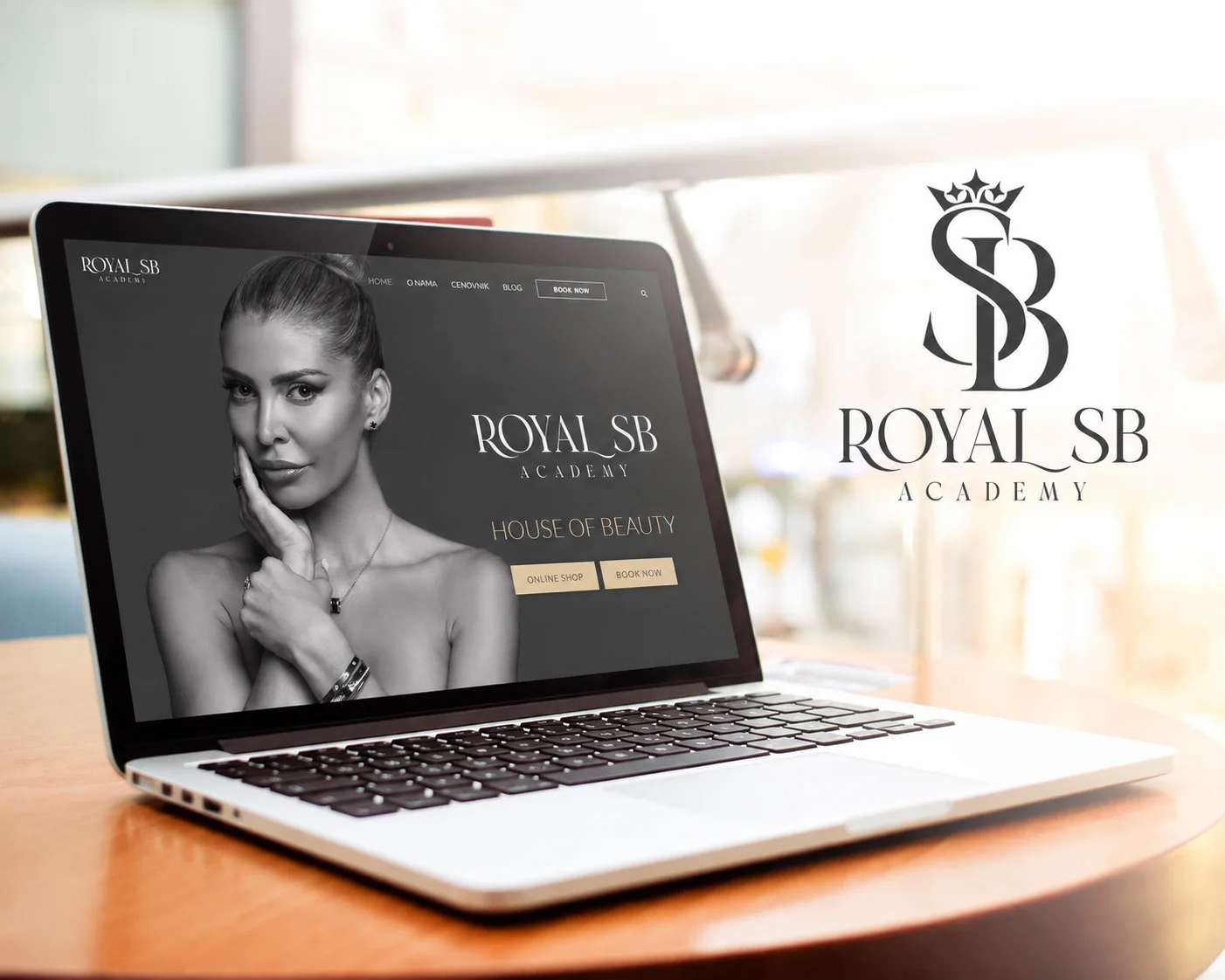
Royal SB Academy is a featured SCART Design project for the beauty centre and academy founded by Snežana Borjan. Here we show the original brand mark alongside the website presentation. The project brings together two related parts of the portfolio: a signature brand mark and a website presentation designed around the same identity.
The original mark: a monogram and crown
The identity features intertwined initials crowned by a refined emblem. The design balances decorative character with a restrained, legible presentation of the name “Royal SB Academy”. The original logo artwork is presented directly from the SCART portfolio, preserving the character of the mark.
Website design as an extension of the identity
The website presentation shows how a recognizable identity can carry through a digital experience. Photography, typography, content structure and visual hierarchy all matter when presenting both beauty services and an educational offering. An effective site should make the brand recognizable while helping visitors understand what is available and where to go next.
What this project shows about our approach
For SCART Design, a logo is not an isolated decoration. It needs to be recognizable on its own, while a website must translate the same brand character into readable layouts across different screens. This project illustrates how a signature brand mark can connect with a clear, recognizable digital presentation.
Explore related work